曲线模块入门
Charts - 0 - 简单入门篇
目录
- 简介
- 画出你自己想要的曲线,回到梦开始的地方
- 一些奇技淫巧
简介
https://github.com/mcconkiee/ios-charts
- Xcode 6.3 / Swift 1.2
- iOS 7.0 (Drag .swift files to your project)
- iOS 8.0 (Use as an Embedded Framework)
I’ve chosen to write it in Swift as it can be highly optimized by the compiler, and can be used in both Swift and ObjC project. The demo project is written in ObjC to demonstrate how it works.
An amazing feature of this library now, both Android and iOS, is the time it saves you when developing for both platforms, as the learning curve is singleton- it happens only once, and the code stays very similar so developers don’t have to go around and re-invent the app to produce the same output with a different library. (And that’s not even considering the fact that there’s not really another good choice out there currently…)
总结:
- 安卓有对应的框架。
- 支持
oc和Swift开发。 - 更多详细内容去上面官方地址查看。
画出你自己想要的曲线,回到梦开始的地方
这是Fasting App中统计一日三餐情况的图表,也是一个最简单的例子,包含了大部分你想要的东西。
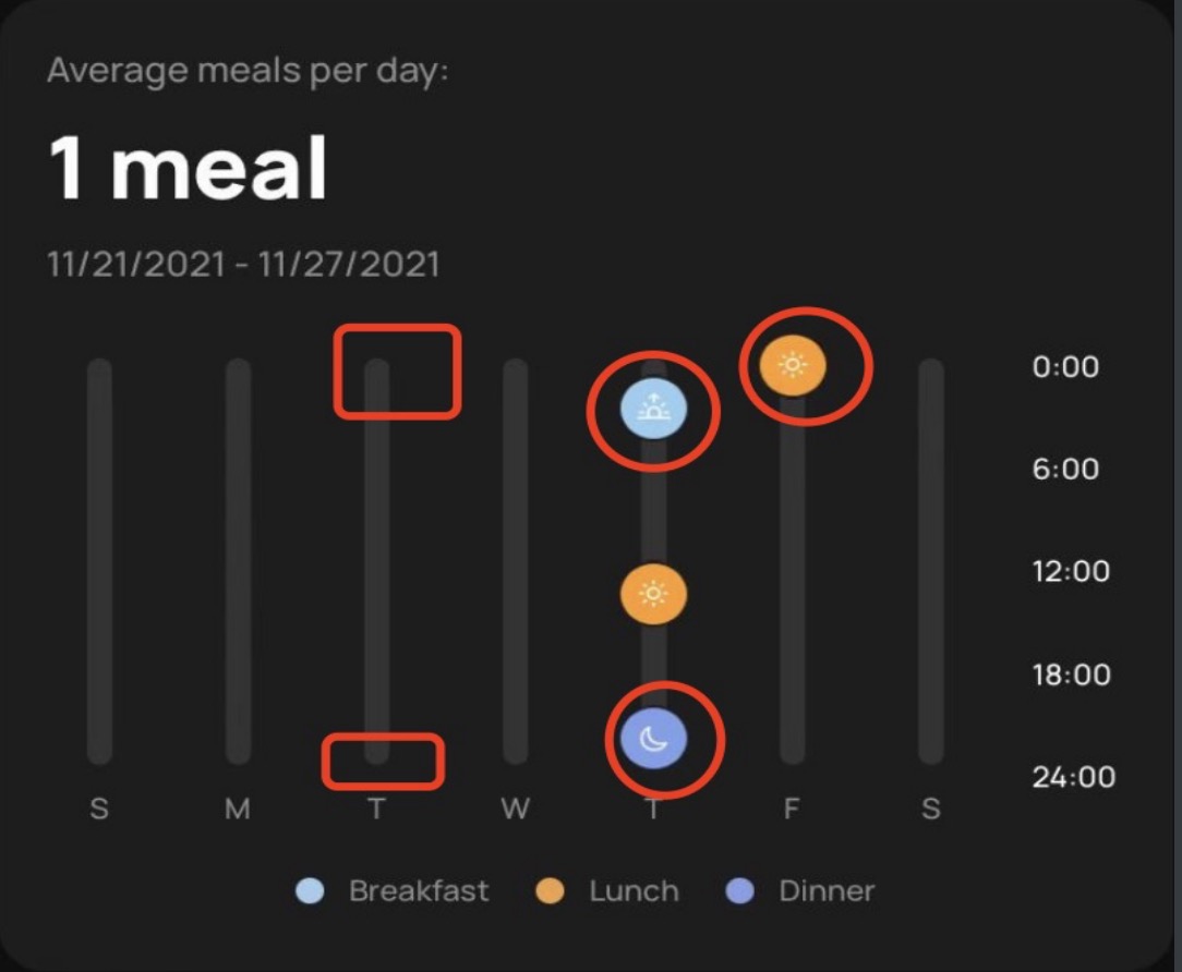
第一步,看看UI稿,看看自己和Charts中哪一种图表类比较接近。
我这里显然是ScatterChart
第二步,初始化你的类,以及一些初始参数,这里我只写一些重要的。
public lazy var chart: ScatterChartView = {
  let view = ScatterChartView()
  view.clipsToBounds = false
  return view
}()

chart.leftAxis.axisMinimum = 0 // y轴最小值
chart.leftAxis.axisMaximum = 24 * 60 * 60 // y轴最大值,一天24小时的秒数
chart.xAxis.valueFormatter = ChartXAxisFormatter() // x轴的显示格式,后面会自定义写一个
chart.xAxis.drawLabelsEnabled = true // 是否显示x轴底部坐标信息
chart.xAxis.labelPosition = .bottom // x轴坐标信息显示位置
chart.setVisibleXRangeMaximum(Double(7)) // 一页显示多少个,这里是每周一页,所以是7
第三步,自定义x轴坐标显示信息。
正常x轴当然是显示数字,我们这边需要自定义显示成 S M T W 这种周期缩写,你需要自己实现一个前面提到的Formatter,代码如下:
private class ChartXAxisFormatter: NSObject, IAxisValueFormatter {
  func stringForValue(_ value: Double, axis: AxisBase?) -> String {
    let weeks = ["S","M","T","W","T","F","S"]
    let v = Int(value)
    return weeks[v % weeks.count]
  }
}
显然,你可以在stringForValue做超高自由度的映射。
第四步,绘制你想要的图形。
在第一张图中我标了一些红圈,它们都是通过Render绘制出来的,我们来捋一下需要做的事情。
A、默认的柱子是一个长方形的,没有圆角,我们需要在它的上下部分各画一个圆。
B、需要把早中晚三种图标绘制到曲线制定位置上。
对于A:
首先先编写一个XAxisRenderer:
open class BMFTTrendDietXaxisRenderer: XAxisRenderer {

  open override func drawGridLine(context: CGContext, x: CGFloat, y: CGFloat) {
    if x >= viewPortHandler.offsetLeft
        && x <= viewPortHandler.chartWidth {
      guard let xAxis = self.axis as? XAxis else { return }
      let halfGridLineWidth = xAxis.gridLineWidth / 2.0
      context.beginPath()
      context.move(to: CGPoint(x: x, y: viewPortHandler.contentTop + halfGridLineWidth))
      context.addLine(to: CGPoint(x: x, y: viewPortHandler.contentBottom - halfGridLineWidth))
      context.strokePath()
      context.setFillColor(xAxis.gridColor.cgColor)
      // 上半圆
      context.fillEllipse(in: CGRect(x: x - halfGridLineWidth,
                                     y: viewPortHandler.contentTop,
                                     width: xAxis.gridLineWidth,
                                     height: xAxis.gridLineWidth))
      // 下半圆
      print(viewPortHandler.contentBottom)
      context.fillEllipse(in: CGRect(x: x - halfGridLineWidth,
                                     y: viewPortHandler.contentBottom - xAxis.gridLineWidth,
                                     width: xAxis.gridLineWidth,
                                     height: xAxis.gridLineWidth))
    }
  }
}
老实说,里面具体逻辑我有点记不清了。不过你只要理解,Chart之后会通过这个类来绘制图中的长方形小柱子就可以了。接着我们还需要手动告诉chart用这个类来绘制小柱子:
chart.xAxisRenderer = BMFTTrendDietXaxisRenderer(viewPortHandler: renderer.viewPortHandler, xAxis:chart.xAxis, transformer: renderer.transformer)
对于B:
首先也是编写一个Renderer
open class BMFTTrendRenderer: NSObject, IShapeRenderer {

  public var image: CGImage?

  init(image: CGImage?) {
    super.init()
    self.image = image
  }

  open func renderShape(
    context: CGContext,
    dataSet: IScatterChartDataSet,
    viewPortHandler: ViewPortHandler,
    point: CGPoint,
    color: NSUIColor) {
    let shapeSize = dataSet.scatterShapeSize
    let shapeHalf = shapeSize / 2.0
    let shapeHoleSizeHalf = dataSet.scatterShapeHoleRadius
    let shapeHoleSize = shapeHoleSizeHalf * 2.0
    let shapeHoleColor = dataSet.scatterShapeHoleColor
    let shapeStrokeSize = (shapeSize - shapeHoleSize) / 2.0
    let shapeStrokeSizeHalf = shapeStrokeSize / 2.0

    var rect = CGRect()
    rect.origin.x = point.x - shapeHalf
    rect.origin.y = point.y - shapeHalf
    rect.size.width = 23
    rect.size.height = 23

    if let image = self.image {
      context.drawFlipped(image, in: rect)
    }
  }
}

extension CGContext {

  /// Draw `image` flipped vertically, positioned and scaled inside `rect`.
  public func drawFlipped(_ image: CGImage, in rect: CGRect) {
    self.saveGState()
    self.translateBy(x: 0, y: rect.origin.y + rect.height)
    self.scaleBy(x: 1.0, y: -1.0)
    draw(image, in: CGRect(origin: CGPoint(x: rect.origin.x, y: 0), size: rect.size), byTiling: false)
    self.restoreGState()
  }
}
这里根据point把自定义的图标绘制到指定位置上,最后在设置数据集的时候,说明使用这个render绘制:
chartDataSet1.shapeRenderer = BMFTTrendRenderer(image: "breakfast_trendz".image?.cgImage)

chartDataSet2.shapeRenderer = BMFTTrendRenderer(image: "lunch_trends".image?.cgImage)

chartDataSet3.shapeRenderer = BMFTTrendRenderer(image: "dinner_trends".image?.cgImage)
奇技淫巧
我在Femometer 的横屏曲线里看到过一些奇技淫巧,比如说前面我们讲的自定义图标,它没有自己写render,而是计算相应point,自己创建一个UIImagView直接盖上去。这样写效果上没什么问题,不过如果需要支持翻页的话就凉了。